


Our world is filled with information. Each time we make an expenditure, engage in a phone conversation, witness a live event, send an email, or click a link, it turns into a data value. However, how can businesses use all that information to make wise decisions? Just as crucial as the evaluation itself is the analyst’s capacity to help others in comprehending the data they present. Entering the world of data visualization can initially be intimidating for beginners. But don’t sweat! You can turn complicated sets of data into visually stunning graphics that tell a story if you have the right method and resources at your disposal. Let’s take a tour through the fundamentals of data visualization.
Why is Data Visualization Important?
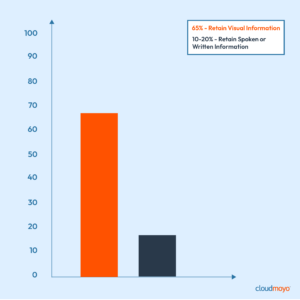
Presenting data in an eye-catching way makes it much easier to understand. Compared to processing words, our brains can digest images a whopping 60,000 times faster. We tend to remember visuals more effectively than text alone. Studies have shown that individuals retain about 65% of visual information compared to only 10–20% of spoken or written knowledge after three days. This emphasis on visuals is crucial in data visualization because it allows us to uncover links, trends, and correlations that might otherwise stay hidden.
By presenting information visually, data becomes more accessible to people of all backgrounds and skill levels, facilitating quicker comprehension of important insights and enabling a more accurate decision-making process.
From Crayons to Charts: The Evolution of Data Visualization
Remember those elementary school days when you had to present a project, but your arsenal was limited to crayons, markers, and poster boards? That was your first foray into data visualization. You’d meticulously plot out information about dinosaurs or the solar system, adding colorful drawings and perhaps a pie chart showcasing your favorite ice cream flavors. As children, we intuitively understand the power of visuals. Whether it’s a colorful bar graph showing the heights of different animals at the zoo or a Venn diagram comparing superheroes, visual representations help us make sense of the world around us. They simplify complex information, making it easier to grasp and remember.
Fast forward to adulthood and our tools for data visualization have evolved significantly. Instead of crayons and poster boards, we now have powerful software like Excel, Tableau, and Microsoft Power BI at our disposal. These tools allow us to create sophisticated charts, graphs, and interactive dashboards with just a few clicks or lines of code.

But it’s not just about the tools; it’s about the understanding behind them. As adults, we’ve developed a deeper appreciation for the nuances of data visualization. We know that choosing the right type of chart can make all the difference in how effectively we communicate our message. A line graph might be perfect for showing trends over time, while a scatter plot might be better suited for identifying correlations between variables.
Cross-Cultural Perspectives on Visualization: Knowing the Global Data Language
Data visualization is praised as a universal language that can communicate complex information in a way that is understandable to all people by overcoming linguistic and cultural barriers, but the reality is much more intricate. The perception, interpretation, and comprehension of data visualizations are significantly influenced by cultural differences.
Culture influences every aspect of our lives, including how we perceive and interpret visual information. Something that one culture finds intuitive or familiar may be completely foreign to another. For instance, there are significant cultural differences in how color is used as symbolism. In many Asian cultures, red is linked to wealth and happiness, even though in Western cultures it may represent danger or good fortune. In the same way, the cultural context can influence the meaning associated with the use of symbols and icons. In certain Middle Eastern cultures, giving the thumbs up is considered offensive, despite it being a sign of approval in Western cultures.
Data visualization reduces cultural barriers and promotes intercultural understanding, despite the difficulties presented by cultural differences. We can design visualizations that speak to a global audience and encourage cross-cultural communication and cooperation by recognizing and embracing cultural diversity. This requires sensitivity, empathy, and a willingness to engage with diverse perspectives.
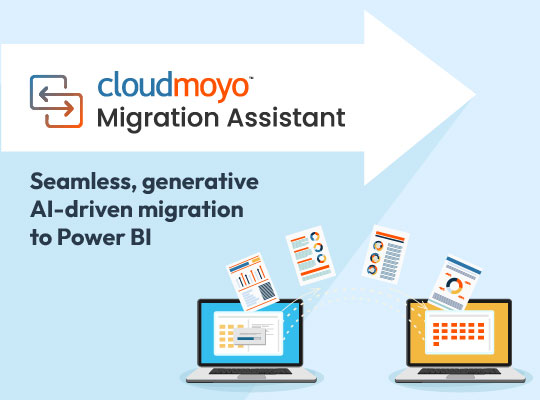
Opening Doors with Microsoft Power BI
Microsoft Power BI stands out as a pivotal data visualization tool suitable for individuals and enterprises alike. With its user-friendly interface and extensive capabilities, Power BI enables users to effortlessly connect to diverse data sources and generate insightful reports and dashboards. Its integration with other Microsoft products such as Excel and Azure further elevates its analytical capabilities, while robust security features ensure compliance and data protection.
Power BI also offers scalability and customization, allowing users to tailor dashboards and reports to their specific needs. Whether adjusting fonts, colors, or layouts, users can easily adapt Power BI to their preferences. This versatility makes Power BI suitable for businesses of all sizes, from startups to multinational corporations, as it can efficiently scale to accommodate evolving data volumes and business requirements. Moreover, Power BI fosters collaboration through its sharing features, facilitating seamless communication and knowledge exchange among teams and departments. This emphasis on teamwork not only enhances productivity but also promotes data-driven decision-making within organizational cultures.
From Data to Decisions: A Visual Voyage
As our exploration of the foundations of data visualization and the function of Microsoft Power BI comes to an end, it is evident that the capacity to convert complex data into engaging visual narratives is a vital talent in today’s data-driven society. Data visualization has evolved from the simple beginnings of crayons and poster boards to the complex tools and technologies of today, enabling people and organizations to gain new insights, spur innovation, and make defensible decisions.
Data visualization not only helps us comprehend information more quickly, but it also helps people communicate and collaborate across cultural and linguistic divides. We can foster intercultural understanding and cooperation more deeply by embracing cultural diversity and creating visualizations that appeal to a worldwide audience.
An effective technique for turning unorganized information into meaningful actions and gripping stories is data visualization. Keep in mind that perfection comes from practice!
As you dive deeper into the world of data visualization, don’t be afraid to try out new methods, try out other tools, and polish your abilities. Explore more about data visualization on our website, where we showcase our expertise or dive in and discover how we bring data to life with user-friendly visuals (sample dashboards)!
