


Have you ever struggled in drawing conclusions from hundreds of rows of information on a spreadsheet? As disruption and digitalization are omnipresent, data is increasing at an ever-growing speed—and so are your spreadsheets. Given these dynamics, it’s practically impossible for the human eyes to make inferences from trillions of data rows generated daily.
As we advance further into how data is created, copied, and consumed, organizations face an increasing need for data analysis, which is constantly undergoing expansion. Both structured and unstructured data sets are inundating businesses, with the global big data market size estimated to reach a $116.07 billion valuation by 2027. And it’s not just IT teams who are interested in how this data is managed and visualized; business users and executives alike are asking for insights to drive strategic decision making and everyday business decisions.
This is how data visualization enters the global data landscape.
There is currently a total of 59 zettabytes of data in 2020. The way the global data landscape is shaping up, data visualization technologies and tools are must-haves to enable enterprises to analyze tremendous quantities of complex data and establish a data-driven culture. And this sort of culture is only possible if every person can access, understand, and utilize data to make confident decisions in-the-moment.
Why are companies using data visualization?
The human brain processes and comprehends patterns and colors the quickest. We have the tendency to internalize what we can perceive with our eyes quickly. This is the governing principle behind the whole concept of data visualization, which allows executives to shrink enormous data volumes into comprehensible visual elements within seconds.
The speed to visualize complex data into charts or graphs is a highly beneficial feature that organizations leverage through interactive visualization tools. Companies utilize data visualization tools and technologies to yield the following benefits:
● Make data accessible to both business users and other stakeholders
● Uncover buried business opportunities via business intelligence and data insights
● Seamlessly understanding customer tends to build stronger customer relationships
● Quickly absorb information to make reliable, insight-driven decisions
● Boost chances of sharing insights with all involved by offering simpler information distribution.
● Curb the need for a data scientist to enlighten the workforce with respect to the data
● Increase speed of time-to-market of products and services due to faster, more accurate decision-making
Organizations across industries extract discrete applications from data visualization tech that may vary on several degrees and grounds. However, every enterprise can derive equivalent value from data visualization of their enterprise data. Also, accelerated decision-making processes and higher fault-intolerance increase the opportunity to streamline revenue streams. As a result, you can expect increased business outcomes with improved returns when complex data sets turn into data assets.
When should you use data visualization?
Every business plan needs to incorporate data visualization to improve and optimize their decision-making process. But when should you use a particular data visualization? Given that there are several ways to represent a specific set of information, it all narrows down to the intended audience and interpretation. Businesses need to understand that using data visualizations will increase the impact on their audience. However, getting it right is the real catch.
Data visualization best practices
Businesses are unique, so what works for one will not work for the other. That being said, there is a set of data visualization best practices that you should follow to design intuitive business intelligence dashboards and reports for your business:
● Identify and understand your audience first:
The purpose of data visualization is to appeal to the users, but you should be careful to interact with users relevant to your business. It will allow you to achieve clarity in terms of resonating the message to the appropriate stakeholders. Also, you must ensure that your visualizations consist of meaningful and actionable content.
The idea behind generating intuitive dashboards is to monitor consumer behavior, track performance, and gauge the effectiveness of the same. For example, you can furnish your business intelligence dashboards with suitable elements like push notifications or visual indicators such as goal thresholds.
● Choose the right visualization type for maximum impact:
The “one size fits all” theory doesn’t work in the case of data visualization for businesses. As mentioned earlier, various data visualization types are ideal for different contexts and purposes. Scatterplots, line charts, pie charts, heatmaps, or bar charts have an entirely varying functionality while representing data. When you make use of the right visualization, the generated impact increases.
● Provide context to your users:
For a layman, industry metrics can be irrelevant, but at the same time, you may want them to take a particular action after interpreting a data visualization. With this in mind, you must aim to help stakeholders better decipher and analyze the statistics and numbers that they’re viewing.
Visual cues such as colors or text enable pupils to interpret information at a glance. Append actionable insights, predictions, and recommendations to your business intelligence dashboards and visualizations for a user-focused design. The more digestible the content is to your niche audience, the more the chances of them taking the right course of action from the insights gleaned.
● Maintain accuracy of data:
Data can offer strategic advantages to businesses, but it’s only worth so much if you don’t maintain data accuracy. False or anomalous data can not only endanger your brand credibility; it can also hamper consumer trust. So ensure that shared information is error-free and effective for the end-user.
Data visualizations help audiences of all levels to readily comprehend high-level information while answering obvious questions. In addition, data analytics and insights are shareable by stakeholders. As a result, it’s your responsibility to maintain the exactness of the data that your audience consumes
The need for data visualization surfaces, naturally, as we have exceedingly high amounts of information at our disposal. But to set up data visualization tools, you need an expert digital partner.
Data visualization tools
Looking to invest in a data visualization tool? One of the most common tools in the market is Tableau, with features such as data blending and real-time team collaboration. Some of Tableau’s advantages include having hundreds of data import options, mapping capabilities, a free public version available, and offering video tutorials for end-users. Microsoft Power BI is another common and user-friendly data visualization tool that enables excel integration, data connectivity, drag and drop features, interactive visualizations, and self-service capabilities. Asides from these two visualization tools, other services to note are Infogram, GoogleCharts, and Grafana.
Use cases for data visualization in different sectors:
How are companies across various industries leveraging data visualization capabilities with Power BI to track key KPIs?
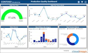
Manufacturing:
Enable your teams to easily track critical metrics around production quality with an interactive Power BI dashboard built for companies in the manufacturing sector. The dashboard visualizes near real-time data around production quality over time, defect density, rate of return by category, and most common defects, so that you can more easily pivot and prioritize issues to address or room to gain a competitive edge in the market while increasing productivity and efficiency.
Engineering and construction:
Data visualization tools like Power BI allow AEC companies to empower end-users, project managers, and executives alike to get insights into critical KPIs, including backlogs, financials, retention, and safety.
CloudMoyo has built out customized, Power BI reports and dashboards for customers in the architecture, engineering, and construction sector. With these insights, companies can improve quality, reduce labor costs, increase bid win rates, improve return on assets, and discover future market opportunities.
The key is in the ability to leverage big data analytics and data visualization tools like Power BI to increase efficiencies and proactively plan for the future.
![]()
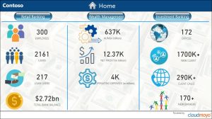
Financial services:
CloudMoyo has built out customized Power BI dashboards and reports for companies in the financial services and banking industries. These reports enable Power BI users and other business users to gain valuable insights into employees, loan users, trending metrics, transactions, operational expenses, and more.
These interactive dashboards give you drill-down capabilities to leverage the power of data analytics to more informed decisions, optimize pricing and product offers, improve collections and recovery, optimize operational costs, and maximize profitability. As a result, your business can reduce customer turnover by improving customer satisfaction and retention.
CloudMoyo data visualization solutions
In the age of big data, data visualization is a potent business enhancement tool. CloudMoyo understands this very well, and so we help our valuable customers leverage next-gen data visualization solutions for better business outcomes.
We empower our customers with powerful data visualization tools to create reports, conduct analysis, run queries, and collaborate and share business intelligence. At the same time, they drive improved business processes and performance and gain actionable business insights with big data analytics, BI dashboards, and BI tools. Over the years, we’ve developed custom solutions build on Power BI for companies in sectors like manufacturing, architecture, engineering, and construction (AEC), transportation, retail, and financial services.
Are you willing to upgrade the way your organization views and consumes enterprise data? Click here to check out CloudMoyo dynamic Power BI dashboards firsthand! Make use of real-time visual exploration and monitoring via immersive and intuitive dashboards. You can unlock the business value of your data through visualization tools like Power BI in our free, 7-day Power BI Proof of Concept.
